According to a 2021 online survey of U.S. teenagers by SKDK, 76% of students associate periods with something unsanitary and 65% agree that society teaches people to be ashamed of their periods.
Over 800 million people menstruate daily and 500 million of those people lack access to menstrual products and hygiene facilities.
(Journal of Global Health Reports)
Seven in ten (68%) people agree that period poverty is a public health issue, but only 4% of Americans are aware of a local resource where free or reduced-cost period supplies are available.
(Alliance for Period Supplies)
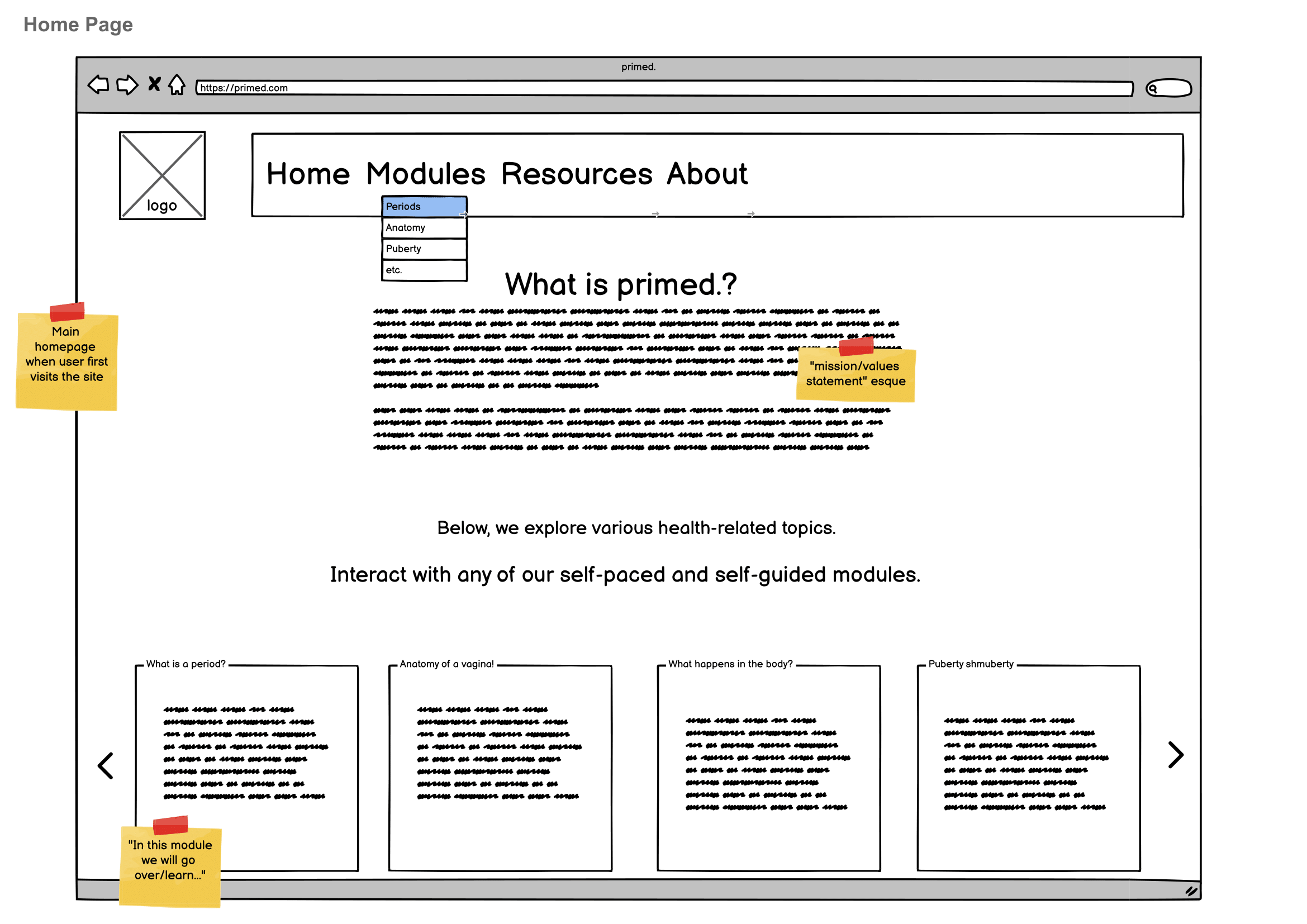
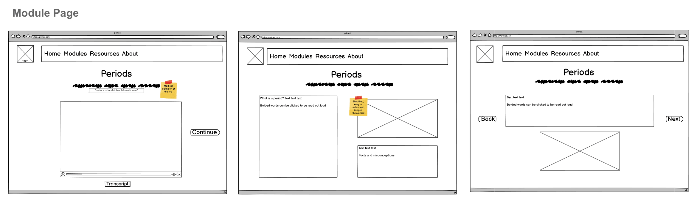
Lo-fi Porotype
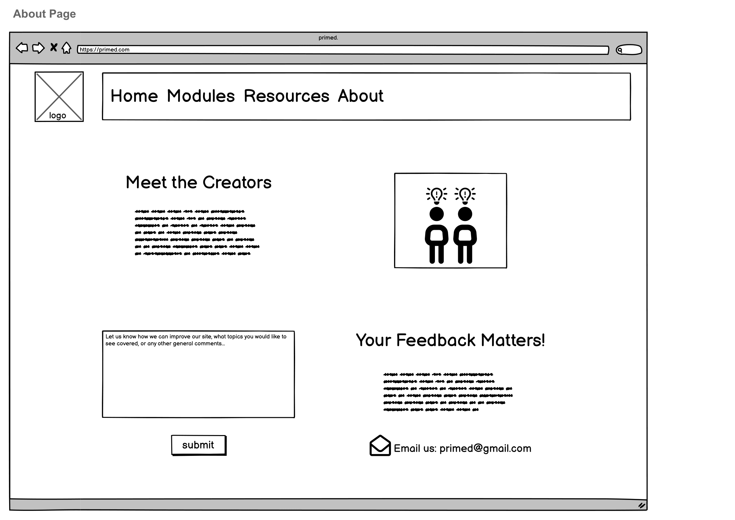
We explored how users would navigate the website and modules since it is self-guided.
The home screen explains the purpose behind the website while providing users with two ways to get to the modules, like from the menu dropdown or slideshow at the bottom. On the module page, we considered how the user may want to learn, whether it be a video first and then text expanding on the information and vice versa.
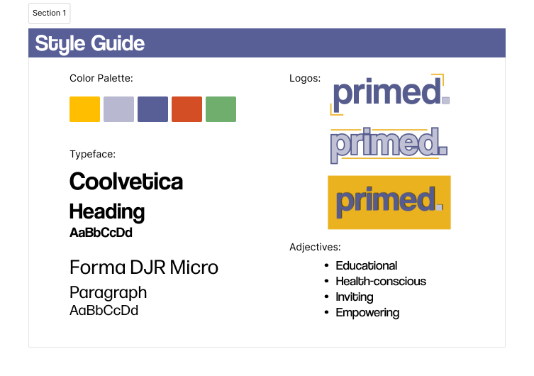
Style Guide
After agreeing on the organization of the pages, we decided on color and typography. Since this is a learning tool for everyone regardless of age or gender, we did not want to include colors associated with a specific gendered identity. To make the website visually interesting, we chose a colorful and vibrant color scheme that most educational websites utilize.
For the typeface, we chose sans-serif fonts that are easy to read but still interesting to look at.
After interviewing 6 participants, we decided to give the user the option to start with the video or text for each module. Also, we included the sticky notes as part of the design because participants found it matched the theme of an educational resource.
Using Figma, we created an interactive high-fidelity prototype that could be navigated through. This prototype includes two modules that are designed by both Emily and me about menstruation and menstrual hygiene materials.
View Prototype